I am Aditya Ranade. A visual designer based in Bengaluru.
For 12+ years, I've been shaping how brands look, speak, and connect — from identity systems and marketing collaterals to immersive landing page experiences.
Philosophy and Value
I think every designer wants the same thing - create experience that accommodates viewer's interactions and response, design to make it last and not to replace and all the visuals should have purpose. I try to Design not to satisfy my designer's ego keeping in mind that designers are not the only users.
Work Experience
Branding: 12+ years of crafting unmistakable brand identities — from corporate branding for Amazon and Booking Holdings to building identities for Aarkam Ventures, Stellaris, IISc Bangalore initiative, Aavatar Ventures, YourStory and more...
Marketing Design: Designing collaterals that bridge online to offline — social media creatives, event branding, and on-package advertising that communicate, captivate, and convert.
Interactive Landing Pages: Building pages that feel more like experiences — curated launch moments for ASUS, Samsung, Noise, and HP, along with curating homepage experiences for Amazon Ads, India.
Featured Projects - Amazon
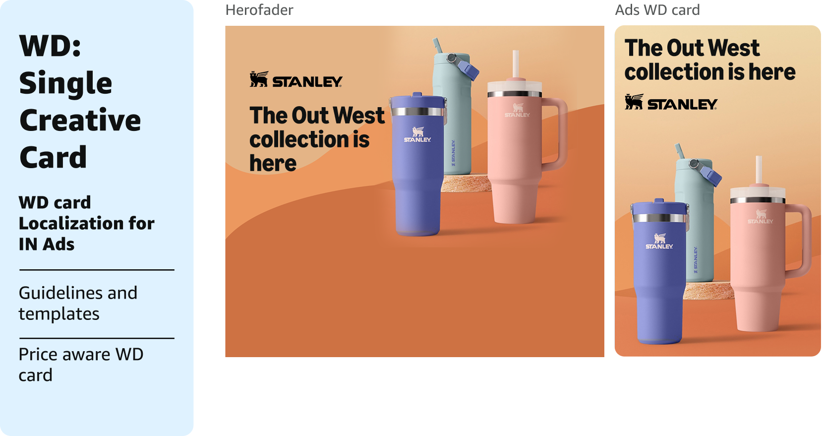
Amazon: Window Display (WD) Card Design — India Ads
Led the design and development of Window Display (WD) card experiences for Amazon Ads, collaborating with the worldwide team to localize and adapt the ad format for the India marketplace.
WD Card Design & Localization
Partnered with the WW team to understand global WD card standards
Identified and integrated India-specific ad nuances (language, layout, cultural context)
Created wireframes tailored for the India Ads ecosystem
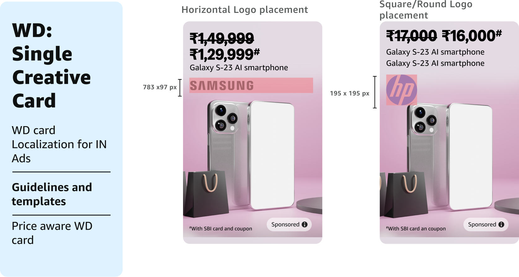
Guidelines & Templates
Authored comprehensive IN Ads guidelines for Window Display cards
Built scalable WD templates for all ad events, enabling consistency and efficiency across campaigns
Price Aware Card (Next Phase)
Collaborated with the Product team to design a Price Aware Card — a dynamic card where the price is auto-pulled from the product landing page
Built guidelines for the Price Aware Card implementation
Documented different permutations and combinations of use cases to support the product team in development and edge-case handling
Custom Landing pages for personalised experience - ASUS
Context: De-growing category requiring innovative brand engagement solutions Objective: Secure brand partnerships by offering premium, experiential custom landing pages that showcase products with rich interactivity, drive awareness of unique product features, and elevate the customer shopping experience.
The Case Study: The ASUS Zenbook custom landing page was designed to communicate the premium positioning and unique technological innovations of the Zenbook series through below three key interactive modules:
Before & After Screen Interaction – QLED Display
Feature Highlighted: QLED Screen Technology
Interaction Design: A before/after slider interaction that allows users to visually compare the QLED display quality against a standard screen
User Experience: Customers drag a slider across the screen to reveal the vivid, true-to-life color reproduction and contrast of the QLED panel — making the display superiority tangible and experiential
Tabular Carousels – Zenbook Range Showcase
Feature Highlighted: Complete Zenbook Laptop Range
Interaction Design: Tabular carousel format with categorized tabs for different Zenbook models
User Experience: Customers can browse through the entire Zenbook lineup in an organized, visually rich carousel format — comparing specifications, designs, and price points seamlessly within the page
Feature Highlighted: Cereluminum Material (Anti-Dust, Anti-Scratch, Shock-Resistant)
Interaction Design: An interactive widget displaying the laptop with multiple tappable icons overlaid on the product image
User Experience: Users tap on individual icons positioned on the laptop body, and each tap triggers a relevant video explaining the selected feature
Purpose: Allows customers to self-explore features at their own pace, creating an engaging, non-linear discovery experience
Audio Store Page – Multi-Brand Interactive Experience
The audio category needed a unified storefront that could showcase multiple brands and product types while educating customers on the experiential value of audio products — something difficult to convey through static product listings alone.
Surround Sound Experience Widget
Designed an interactive surround sound simulator with three toggle switches — Soundbar, Sub Woofer, and Rear Speakers
Users can switch each speaker on/off individually or together to experience the layered audio setup
Communicates the value of a complete surround system in an engaging, self-exploratory format
Use-Case Based Tabular Carousels
Built tabular carousels where each tab represents a use-case (e.g., movies, music, gaming, parties)
Products are dynamically showcased based on the selected use-case
Helps customers find the right product for their specific need
Multi-Page Architecture (Cross-Sell Structure)
Designed three dedicated pages — Soundbars, Party Speakers, Bluetooth Speakers
All three follow a consistent structure and are interconnected via tabs
Enables cross-selling across audio categories within a single store experience
Ads can be redirected to the respective category page, making it a versatile landing destination for campaigns
Other Projects
DHRUVA – Digital Health Initiative Identity Design for IISc Bangalore
IISc Bangalore launched DHRUVA— a digital health course initiative — and needed a brand identity that appeals to a young audience, communicates the forward-thinking nature of digital health, and works across marketing collaterals, publications, and web. The primary deliverable was a course book that needed to feel fresh, accessible, and distinct from traditional academic materials.
Brand Identity – The North Star Concept
Designed the DHRUVA logo — a custom "D" monogram with a North Star passing through it, symbolizing guidance and direction in the digital health space
The star represents the Dhruva (Pole Star) — a constant, guiding light — aligning with the initiative's mission to guide young professionals into digital health
Standalone symbol - The "D" with the star works independently on marketing collaterals, ensuring recognizability even without the full wordmark
Typography - Bold, sans-serif, uppercase — easily identifiable from a distance, modern and youthful
Colour Palette - Navy blue and golden yellow — chosen to reflect the digital health sector while remaining vibrant and appealing to a young audience
Course Book Design (Primary Deliverable)
Designed the complete course book for the DHRUVA initiative
Applied the multi-color section system for easy navigation and visual variety
Clean, modern layout that makes digital health content accessible and engaging for a young audience
Balanced academic rigor with visual appeal
Use-Case Based Tabular Carousels
Built tabular carousels where each tab represents a use-case (e.g., movies, music, gaming, parties)
Products are dynamically showcased based on the selected use-case
Helps customers find the right product for their specific need
Branding Initiative – Identity & Creative Development
The organization launched an employer branding program and needed a cohesive identity system that could unify all communications — from digital presence to physical event collaterals to social media campaigns. The initiative required: - A distinctive design language that captures the essence of the employer brand - A scalable creative system that works across multiple touchpoints - A promotional strategy to drive awareness and engagement internally - A centralized digital destination (website) to house all resources and information
I led the complete creative development for the employer branding initiative — from design language creation to multi-channel execution — building a unified brand ecosystem that brings the employer brand to life.
Design Strategy
Designed the visual language for the initiative
Developed the creative strategy and authored a creative guide as the single source of truth for all brand outputs
Video Production
Developed the video concept and storyboard for the initiative's promotional film — defining narrative arc, scenes, and messaging
Design Strategy
Designed the visual language for the initiative
Developed the creative strategy and authored a creative guide as the single source of truth for all brand outputs
Video Production
Developed the video concept and storyboard for the initiative's promotional film — defining narrative arc, scenes, and messaging